GoPro Quik
Overview
GoPro’s insanely successful action camera has a global footprint. Millions of people are using it to document the adventurous side of their lives. GoPro has a problem though, their current mobile app is only good for three things — looking at photos people have taken on their own cameras, editing those photos, and looking at photos other people have taken. For a camera that’s changing the world, this app is admittedly dull and doesn’t push the envelope. GoPro Corp. has requested the delivery of a new mobile app, one that stands out from the photo environment today (Instagram, Vsco cam and Snapchat), one that will appeal to millennials.

Design Process
Double Diamond
Convergent / Divergent Processes
Agile Teamwork
Optimise through iterations
My Role
UX Design & Researcher
UI Designer
Main presenter
Tools Used
Miro
Google Docs
Google Slides
Google Forms
Figma
Zoom
Slack
Challenges
12-week timeline
All suggested technologies need to
be available on the market today.
Covid currently restricting face to
face meetings
Cost of new application may be high.
Team Values
Honesty
Collaboration
Disciplin
Constraints
6-week Design Sprint
Completely remote
pandemic restrictions

Research Objectives
What features and functions would the user desire for the new app?
What critical features are competitors offering their users to keep them happy?
What is the current experience of users on the current application?
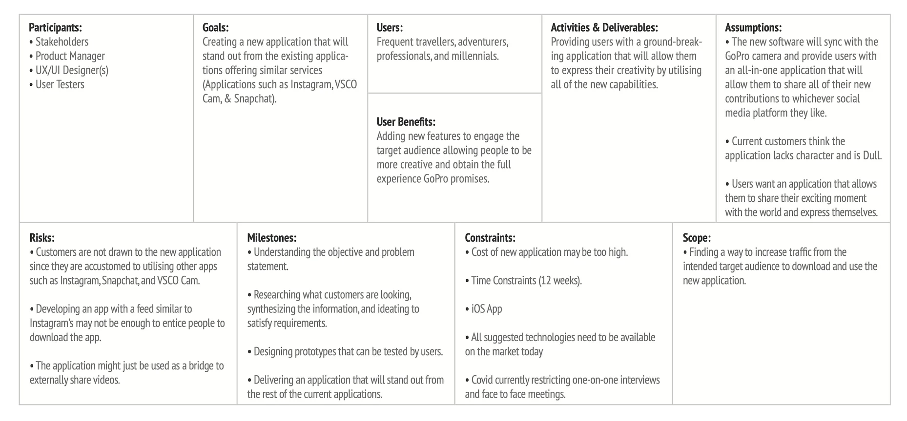
Scoping Framework
The Framework of Scope delineates a vivid impression of the individuals who'll partake in this endeavor and identifies where to gather necessary information. This enables greater concentration on essential objectives, the consumers involved in usability tests, and the advantages the app will yield. The scope lays emphasis on crucial deliveries, keeping up with the timeline, and navigating any possible constraints or risks. The paramount principle to keep in mind during the HCD practice is to prioritize the user, ensuring that the end product is something consumers will appreciate.
Market Research Findings
Affinity Mapping
Empathy Mapping
Insights + Pains & Opportunities
Personas
Interview Findings
Users who are currently using GoPro Quik and similar applications were interviewed one-on-one to learn the reasons for the success or failure of the applications. To learn more about what's working for GoPro Quik's competitors, a number of users who are currently editing on various software were questioned to gain a better picture of how other applications differ from GoPro Quik.
Key Findings:
Competitor apps provide consumers with quicker sharing options and tutorials on how to use the app.
Users found more editing functions on other applications.
Navigation of the application seemed to be much easier on other applications.
Users had the ability to see what others were posting on their news feed.
Usability Testing - Current Application
The existing selling experience was tested with the same seven participants. The goals were to understand the challengeswith the selling process, and why users might be dropping out of the selling process.
Users were asked to perform a number of specific tasks, and asked to rate their experience, and were then asked a number of exploratory questions.
Users were asked to perform tasks and rate their experience followed by exploratory questions.
Usability Testing - Painpoints
Limited Features
The app lacks features users are wanting to edit their videos.
No Creative Control
Users have very limited creative control over their video editing.
Manual Control
Users said they had to keep dragging videos instead of automatically being adjusted.
Trial and Error
The application does not teach the user how to use the application, they felt like it was a matter of trial and error.
No Quick Editing
Users complained there was no way to edit videos quickly, everything took a lot of time.
No Community
The application lacked awareness due to no community existing.
Opportunities
Taking all of the consumers' frustrations and converting them into opportunities aided in the development of ideas that will be included in the solutions.
Users want to be educated on how to use the application.
Users wanted an easy way to share their videos directly to other social media platforms.
Users wanted the application to have more features that would allow them to be more creative with their work.
Users asked for the application to automatically create short videos from snippets they shot.
Key Insights
Users are unable to share content directly from the GoPro app to other social media platforms.
Users feel unmotivated by the limited features available when editing videos.
Users felt confused by the app home page as it does not indicate where the user is.
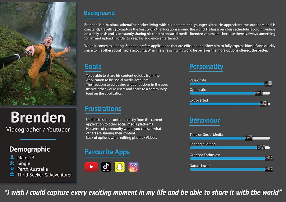
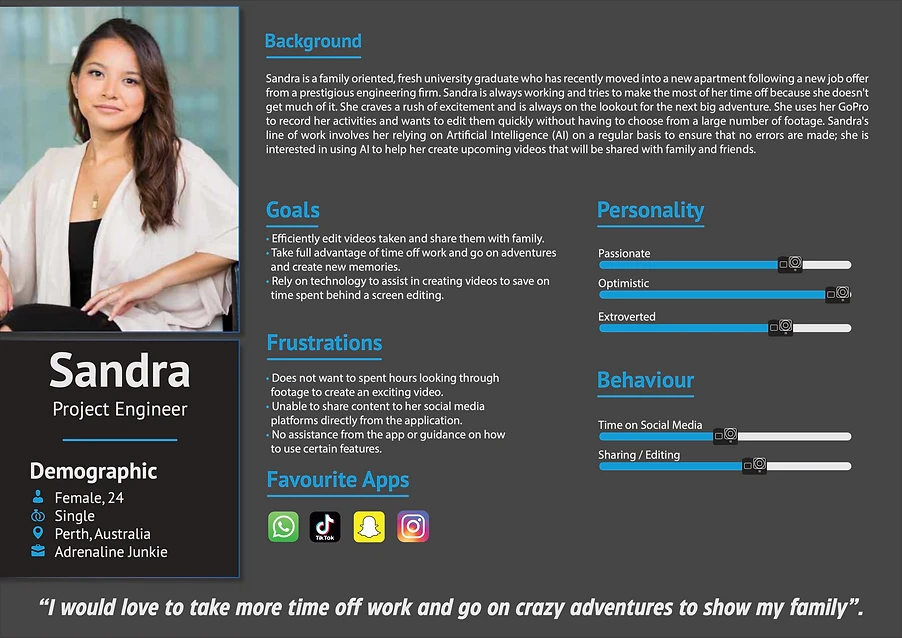
Personas
Based on the types of people interviewed, the audience was made up of business owners and individual sellers. The goals and pain points of these two user types were very different. To better understand who we were creating for, we created personas.
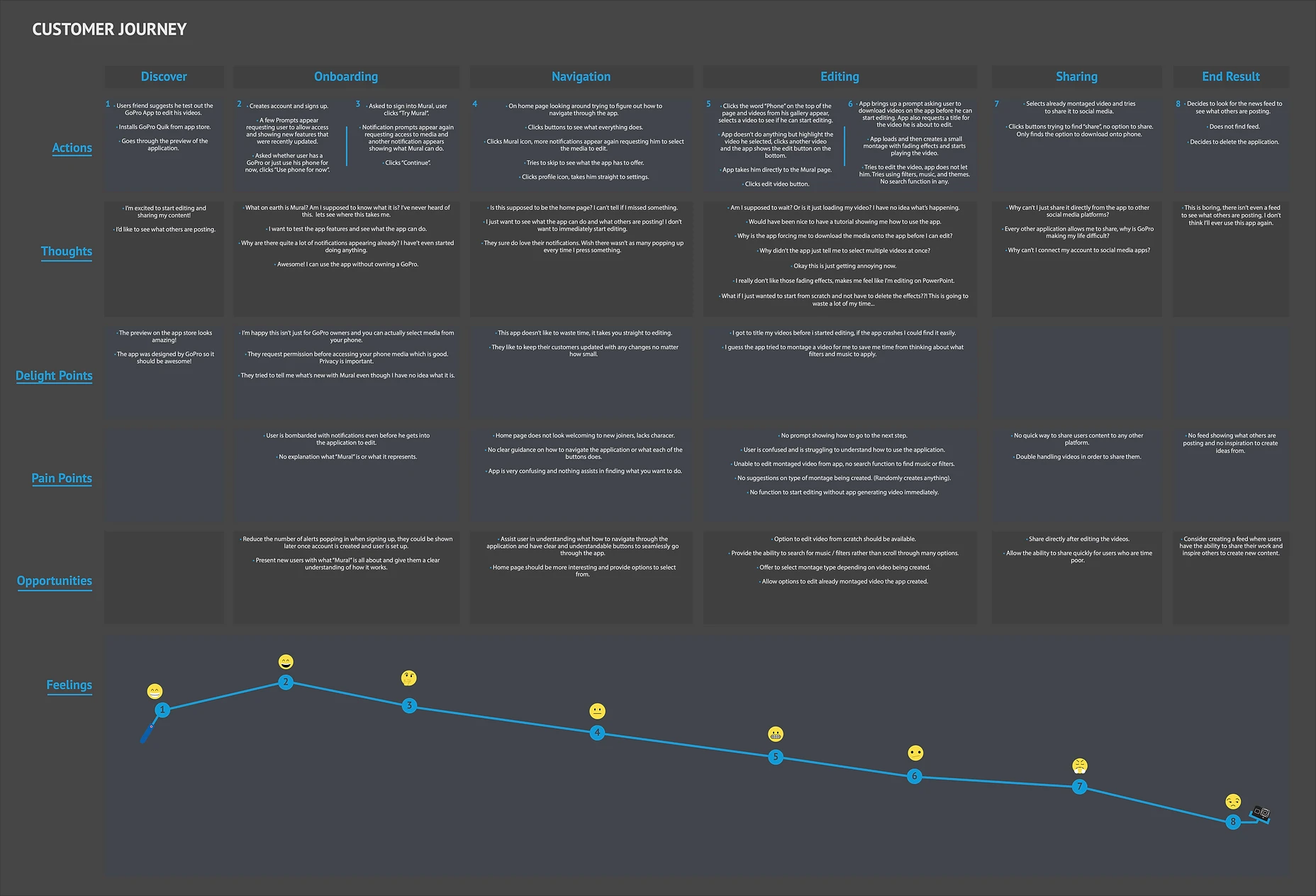
Customer Journey
Brenden’s customer journey was created to help understand the steps users will take when using the present app. This will help in grasping the Pain points, opportunities, Feelings, and thoughts he may encounter. The journey will direct the applications changes in order to make it more appealing to other users.
How Might We / MVP
Crazy 8's
User Flow
Information Architecture
Ideation (Brainstorming)
Customer Journey Map
Storyboard
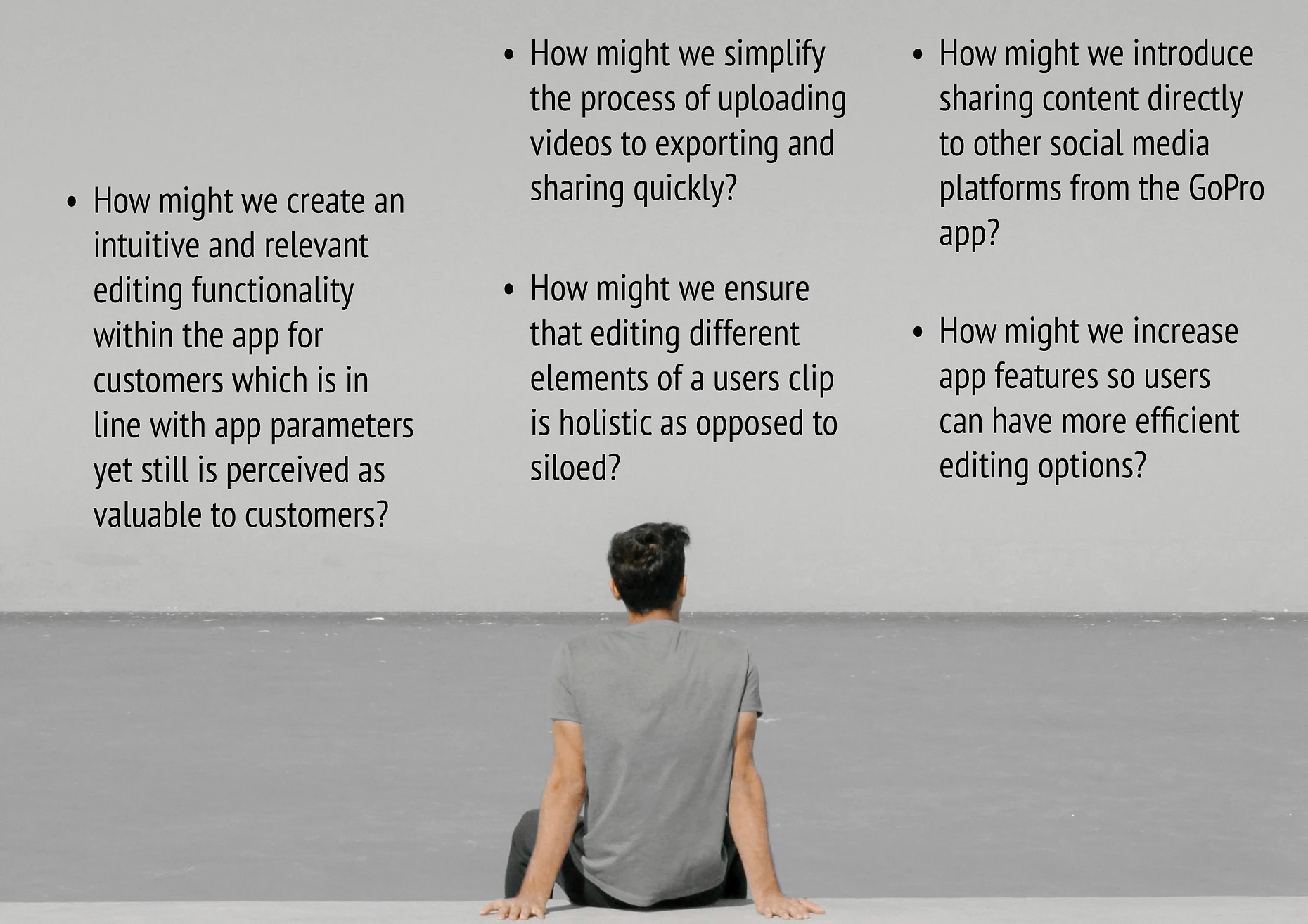
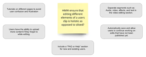
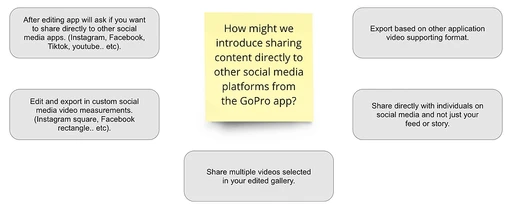
How Might We
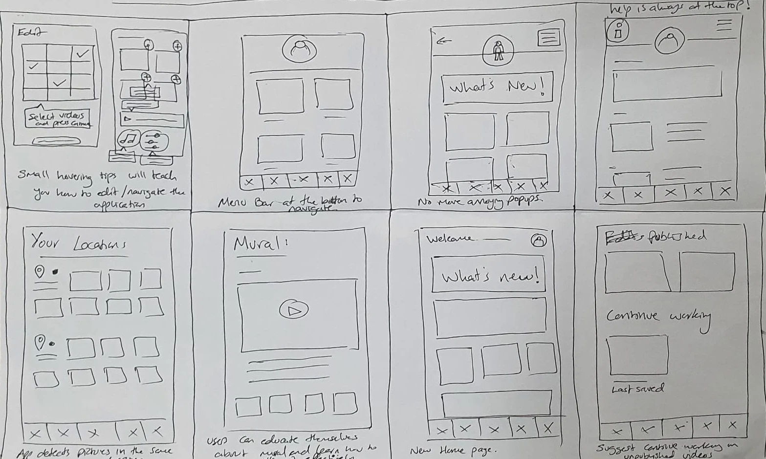
Crazy 8's
Following the completion of the HMW questions, the process of sketching out ideas to assist in the development of the prototypes' early designs began. A number of solutions were designed based on user input from affinity mapping, empathy mapping, and the Personas' pains and gains.
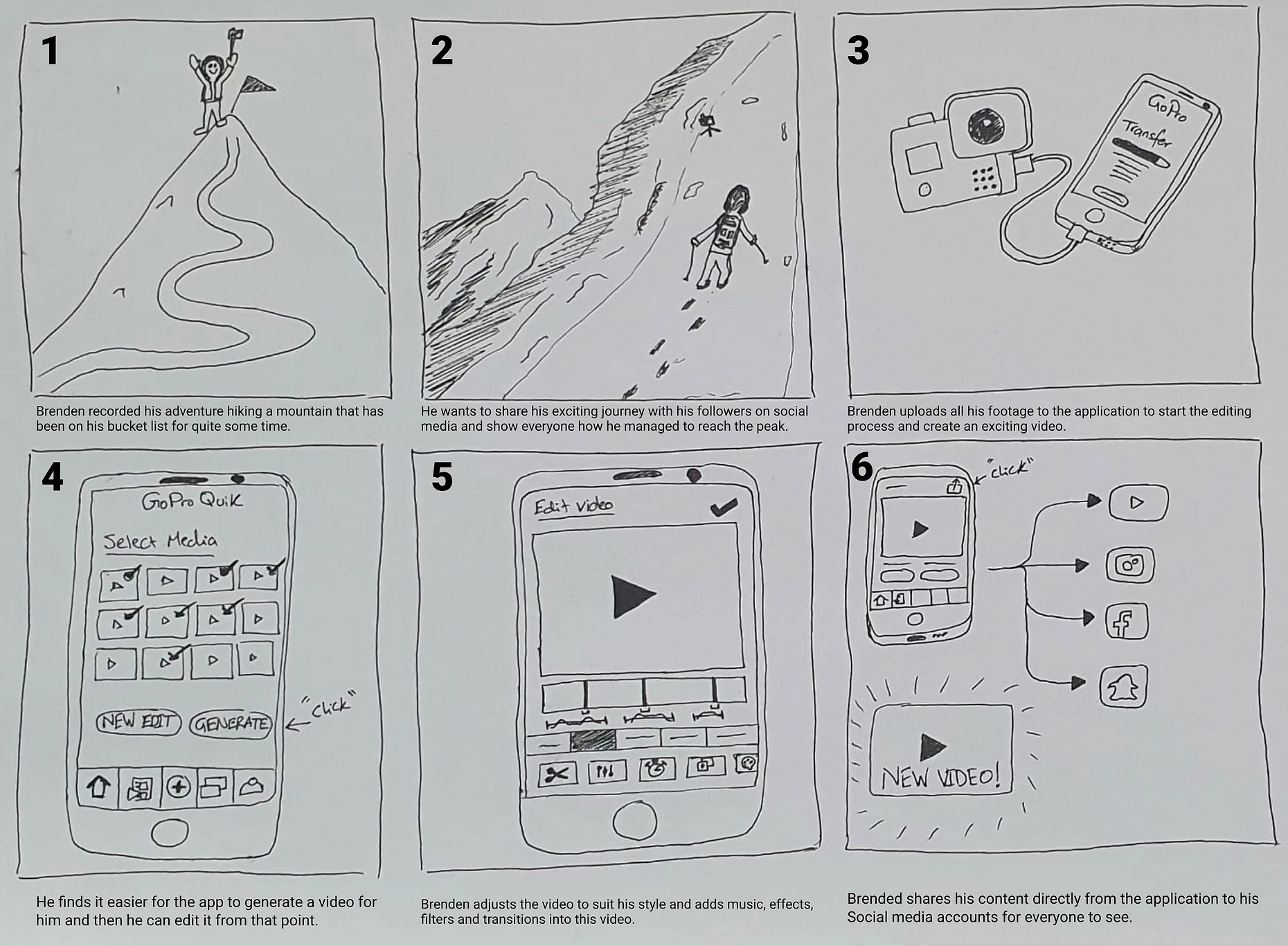
Storyboard
Creating the storyboard assisted in outlining the steps a user would take to record and edit previously recorded footage. The storyboard painted a clear picture of how customers might wish to edit their movie on their phone quickly and effortlessly, then post it on social media platforms.
Brainstorming
After the HMW questions were generated, users presented their own ideas for possible solutions. Some of which included:
Application auto-generated montages.
Clear navigation panel.
Share multiple videos.
Add music to your videos.
Share directly from the application.
"What’s new" page for updates.


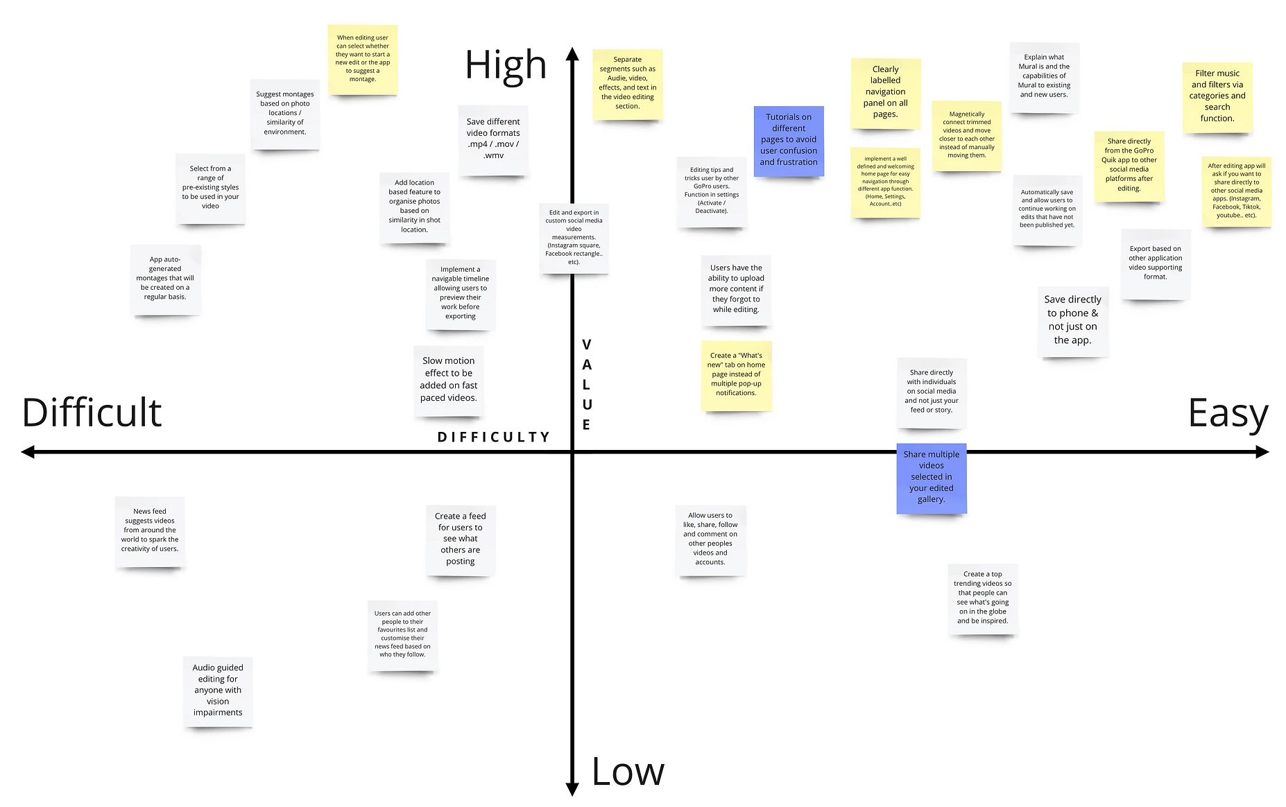
MVP
After reviewing the HMW questions, the data was entered into a Minimum Viable Product matrix to help prioritise concepts that met the persona’s needs and the client’s brief. Prioritising high-value concepts that correspond to user requirements is a top focus.
Current Information Architecture
The current information architecture provided a clear indication of why users are having difficulty navigating the application. Users must go through multiple tabs to reach their desired page. Users also claimed that the application lacked clear labels or icons to guide them. Users are now unable to share their edited videos directly to other social media sites via the application. Users have stated that they are currently solely using this app as a bridge to edit and share content on other platforms. Card sorting was skipped because the application was designed to meet the expectations of the user in terms of features, functions, and sharing to other social media platforms.
The editing features currently available only allow users to adjust certain features and does not provide any kind of creative freedom. Users want more options and features. With sharing content, users are only able to save media to their Mural accounts and then save it to the device. They would like to share directly from the app to their social media platforms.
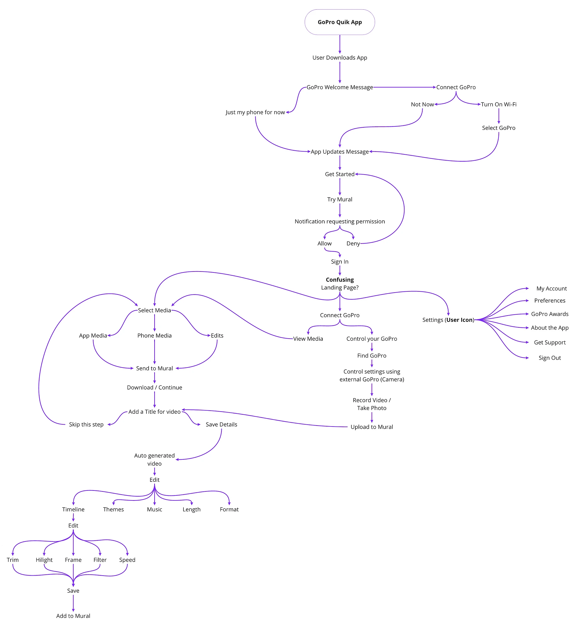
Updated Information Architecture
After reviewing the current information architecture, it was clear that users wanted a slimmer approach and a cleaner home page to navigate the application, allowing them to reach any section of the application. Due to constant updates, users have complained about the relentless pop ups that keep popping up. Users wanted the updates in a separate section on the app.
Users can access media on their cloud, phone or GoPro device in order to start editing their videos. An auto-generated montage will be created once the users select multiple videos and start editing them to make it easier for the user rather than starting from scratch. Users can now search for music to be added to their videos or upload from a variety of options. Exporting a video will now allow them to share it to other social media platforms and contacts from within the application.

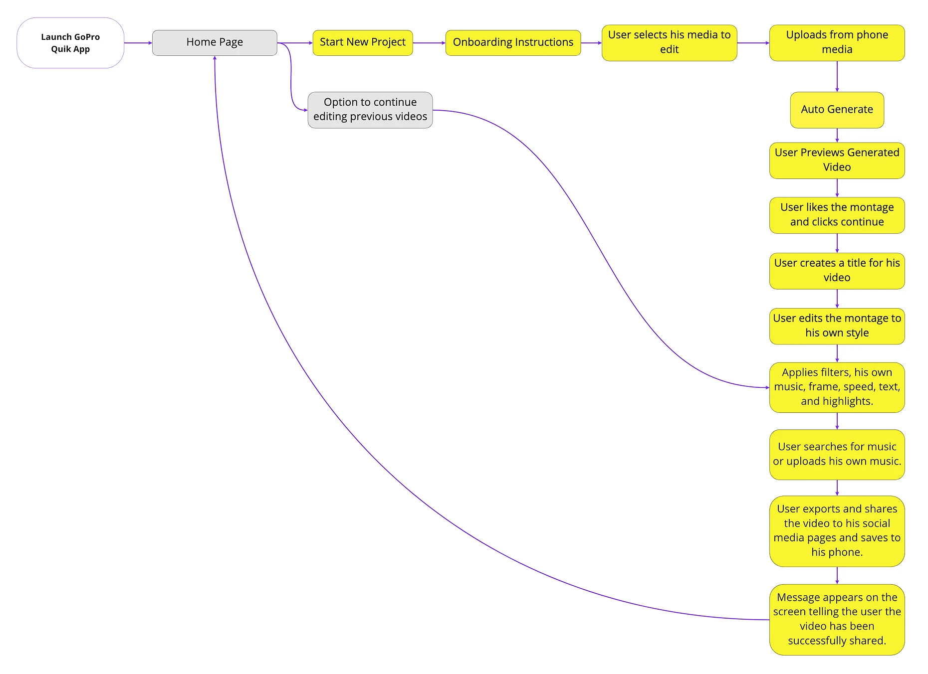
User Flow
The user flow was designed to show the ease of navigation the user will be going through while using the application. Users are now onboarded on how to use the application when they select “New Project”. This will ensure that all users are given the option to learn how to use the app before they get lost trying to learn the features of the app.
This will allow users to preview any montaged videos the application will generate in order for them to select one or all of the options. Users will also be able to share their videos directly from the application to their favourite social media platform and directly share the video with their contacts.
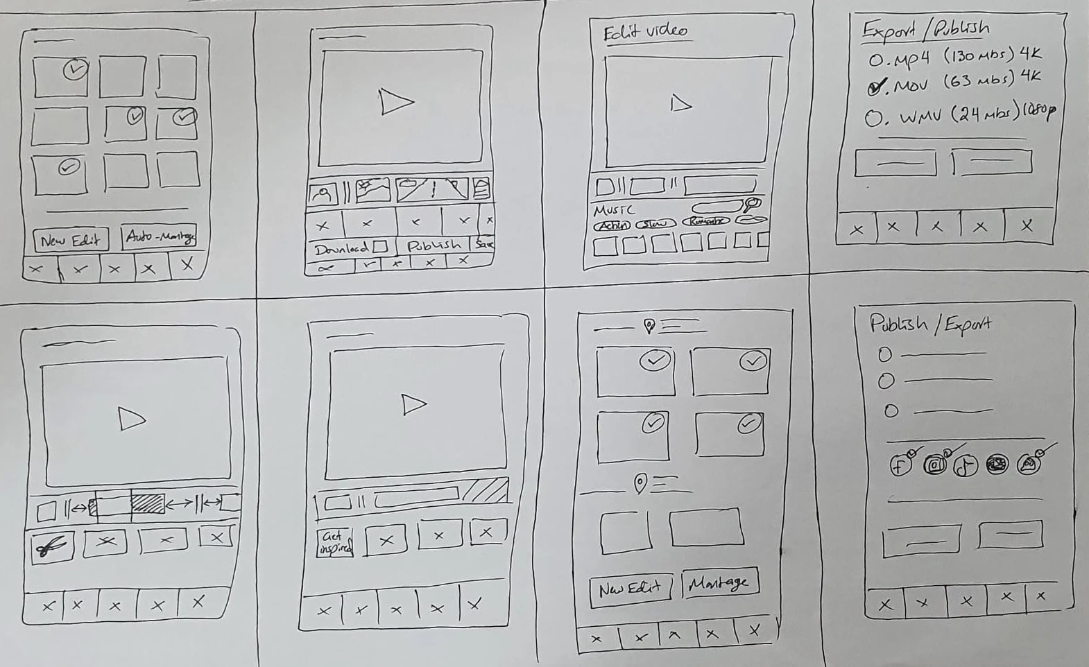
Wireframes
With all of the data and research acquired earlier, a wireframe was created to meet the user’s needs and the client’s brief. Creating multiple page layouts helped in figuring out what would work best for the user. This laid the groundwork for creating a prototype that meets the needs of the users
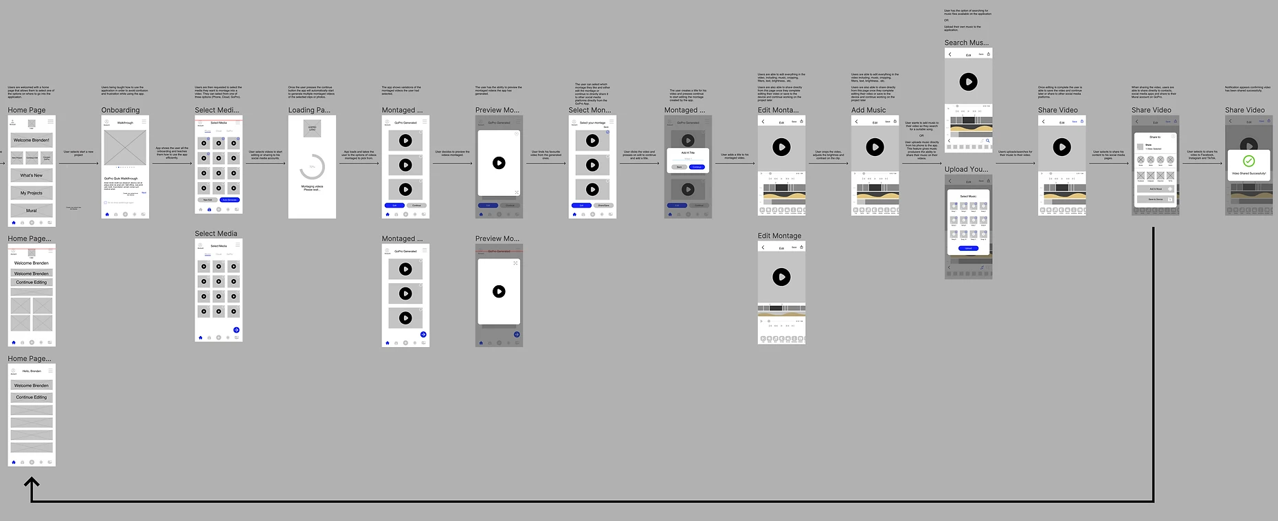

High-Fidelity Wireframes
Usability Testing
Prototype
Summary
What's Next
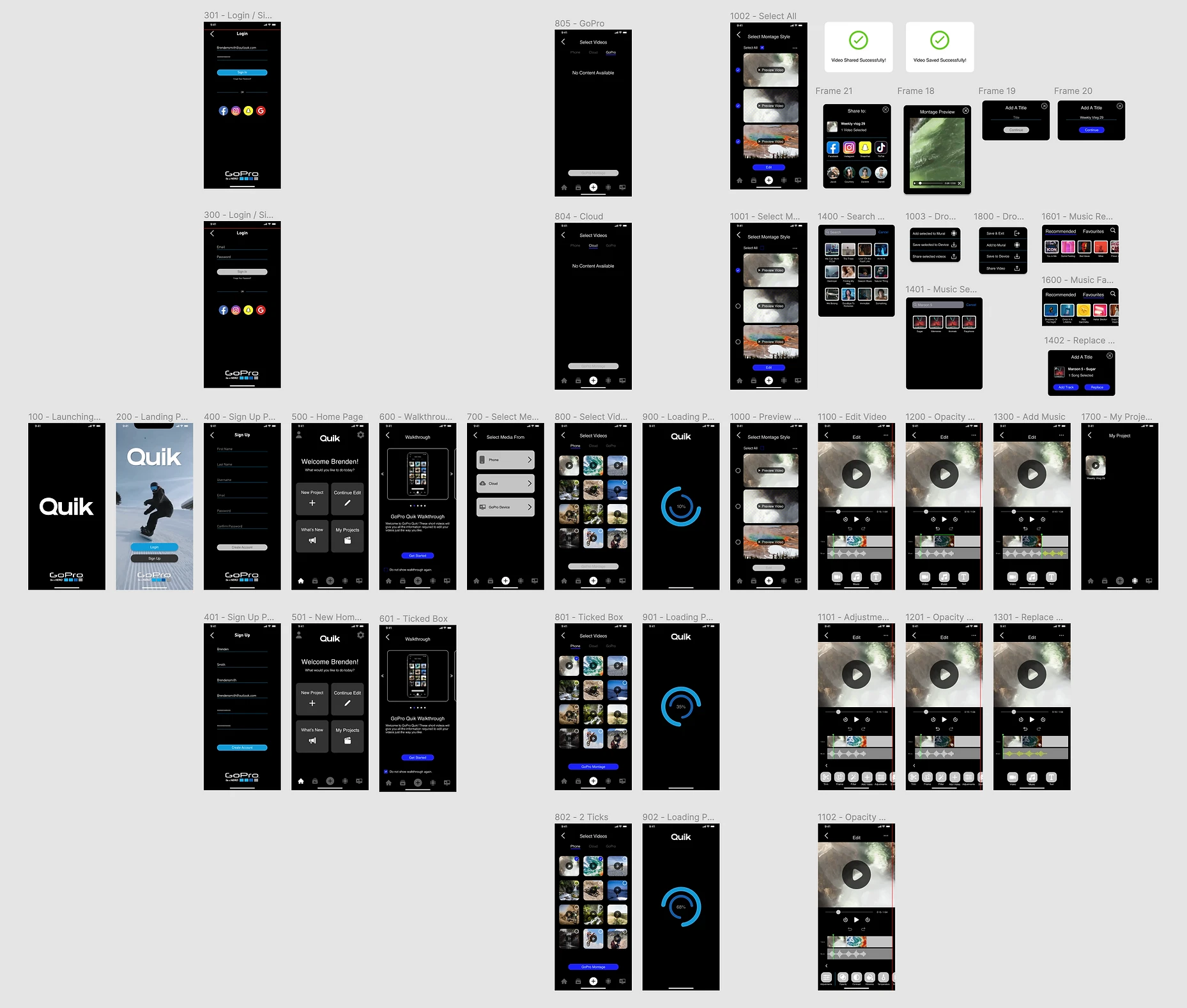
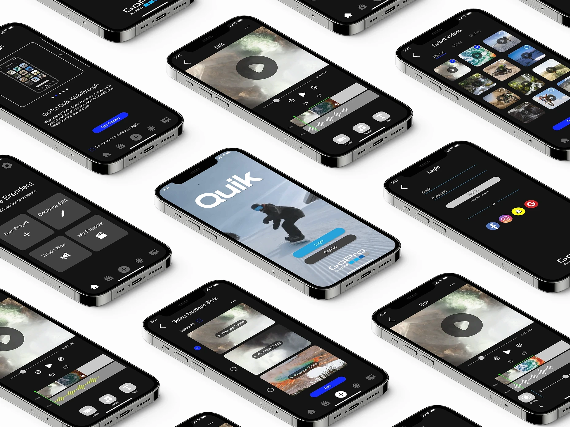
Initial Prototype
The GoPro Quik prototype was created using all of the data and research received from users as well as desk research to meet the client’s needs. To avoid confusion, users will now be provided with a walkthrough to understand how to browse the application and how the functions work. The new GoPro Quik app gives users the option of starting a fresh project or letting the application artificial intelligence build a montage for them. Before altering or sharing their media, users can see the montages made by the software. Users may now store their movies to Mural, Device, and share them on their social media profiles right from the application. User testing will determine how the application development is progressing and how users react to changes.
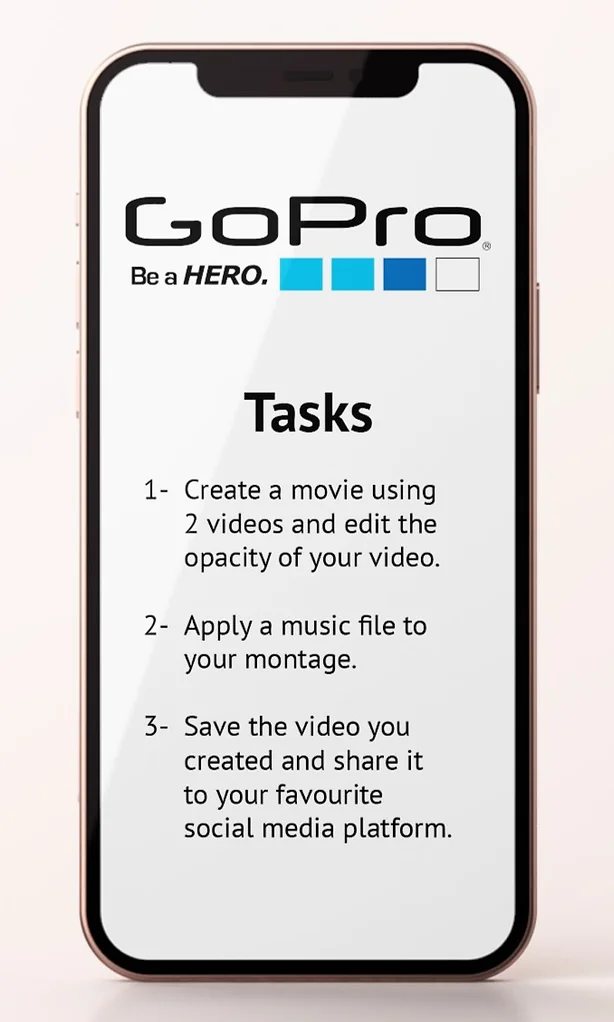
User Testing Tasks
Tasks were given to the user testers in order to see how they would navigate the application. Users were given 3 tasks to complete and were asked to think out loud while they were performing their tasks. Users were aware that the session was being recorded and the purpose of this activity was to test the application and not them. Users were also requested to alert us once they believed they had completed a task or if they were unable to complete a task.
User Testing Insights
Users find it easier to let the app montage a video for them on the mobile app rather than start from scratch. The (i) indicator was not necessary as they only wanted the option to create using GoPro Montage.
Users wanted the walkthrough slider to be more visible as they didn’t know there were more slides.
Users also wanted an indicator to show what parts of their videos have been adjusted and a slider to show what part of the video they have reached.
Users wanted the ability to undo and redo while editing.
When adjusting sections in a video, users preferred having the checkmark or the X button on the bottom rather than above the selected function.
OUT OF SCOPE:
Users wanted the ability to filter through their photos and videos via date, size, quality. etc.
Users wanted to be able to edit the videos in landscape mode.
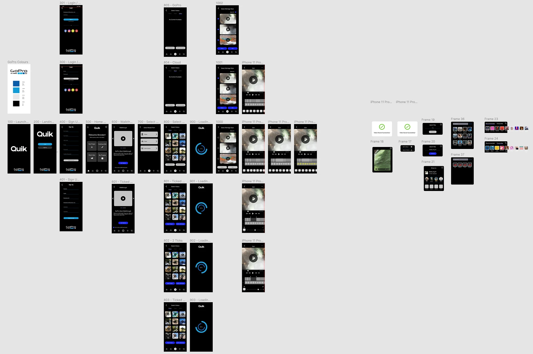
Final Prototype
What's Next?
Conduct further user testing to ensure that all parts of the project are covered to suit the needs of the users and clients.
Additional features will be included in the design to ensure that users may utilise the application to post their next experience.
