Charity Bay
Overview
charityBay is a marketplace website dedicated to donating a part of its purchase price to any registered charity of your choice. The idea is to indicate the percentage of the sale proce that you would want to donate to charity and also select the charity when listing an item for sale. charityBay would be the intermediary that would send the designated portion of the sale price to the charity. The site is used by buyers, sellers and charities however, the owner, Haidar Al Falouji, needed help with the seller journey specifically, as he noticed that sellers were dropping off partway through the process and not completing the journey to a listing.

Design Process
Double Diamond
Convergent / Divergent Processes
Agile Teamwork
Optimise through iterations
My Role
UX Design & Researcher
UI Designer
Collaborative presenter
Tools Used
Miro
Google Docs
Google Slides
Google Forms
Figma
Zoom
Slack
Challenges
6-week timeline.
Difficulty recruiting small/medium
businesses for research
Team Values
Honesty
Collaboration
Disciplin
Constraints
5-week Design Sprint
Completely remote team
pandemic restrictions

Market Research Findings

Competitor Analysis

Heuristic Review
For this project, we used Kaniasty’s Carmel Guidelines to gauge how usable charityBay's website was. The guidelines look at Consistency, Accessibility, Recovery, Memory, Efficiency, and Language in assessing usability.
Consistency
Improving the consistency of the language in the selling process would improve usability. The words "sell", "donate", and "listing" are often used interchangeably.
Efficiency
Some layouts were inconsistent. For example, the listings search bar did not appear on smaller screens and would not have been seen without the user scrolling.
Recovery
Error prevention could be improved. For example, if a mistake is made during the listing process, the user will be sent back to the top of screen regardless of where on the screen the error was made.
Affinity Mapping
Empathy Mapping
Insights + Pains & Opportunities
Personas
Interview Findings
One on one interviews were conducted to gain a deeper understanding of users' experience with selling online and donating to charity. To evaluate the selling process on CharityBay, usability tests were conducted with each of the interviewees.
Key Findings:
Transparency was very important. Users wanted to know exactly how donations would be used, and needed explanations for any fees incurred during the donation process.
Users tended to give to charities they already knew, and liked to do their research before trusting a new charity or donation platform.
Users wanted a quick, simple selling process that is clearly defined and doesn’t take up too much time.
Usability Testing - Current Site
The existing selling experience was tested with the same seven participants. The goals were to understand the challenges with the selling process, and why users might be dropping out of the selling process.
Users were asked to perform a number of specific tasks, and asked to rate their experience, and were then asked a number of exploratory questions.
Usability Pain Points
Too long
The selling process was too long.
Too Complex
The selling process was too complex.
Lack of trust
Users did not trust some charities due to the lack of information.
Sell button
The sell button is confusing and
hard to read.
Impact Unknown
Donors want to know exactly what impact their donation is having and how much the charity is spending on charity work.
Opportunities
Taking all of the consumers' frustrations and converting them into opportunities aided in the development of ideas that would be included into the solutions.
Businesses want to be able to sync inventory with other platforms
Users usually give to large, reputable charities they are familiar with, such as UNICEF
Users do a lot of research before donating to new charities, and want to know a charity is trustworthy before donating
Bring CharityBay's mission to the landing page, or encourage users to find out more
Personas
Based on the types of people interviewed, the audience was made up of business owners and individual sellers. The goals and pain points of these two user types were very different. To better understand the target demographic, personas were created.

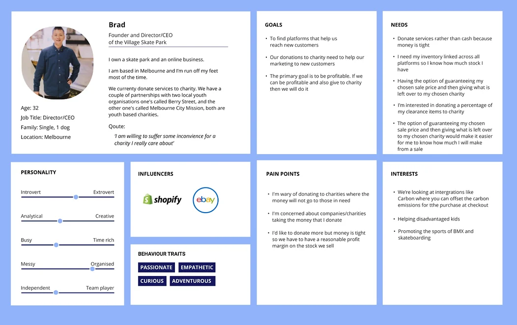
Business Owner Persona
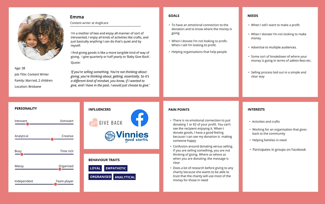
Individual Persona
How Might We / MVP
Crazy 8's
User Flow
Information Architecture
Ideation (Brainstorming)
Customer Journey Map
Storyboard
How Might We
Insights were used to develop a number of how might we (HMW) statements. HMW statements were used to generate a number of ideas for improving the sellers' journey. We refined our statements down to:
HMW clearly communicate CharityBay's mission and motivate sellers?
HMW help users build trust in the charities on charityBay?
HMW offer a quick, simple and engaging selling process?
HMW help businesses reach new customers and become more profitable on charityBay?
HMW improve transparency around fees and costs on CharityBay's website and within the charity descriptions?
Brainwriting
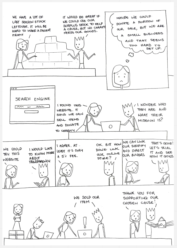
Storyboard
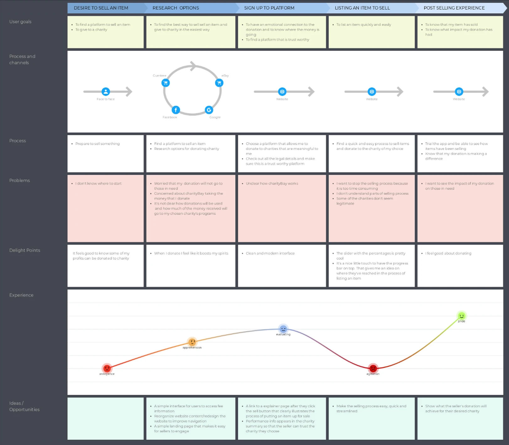
Customer Journey Map
Business owner seller
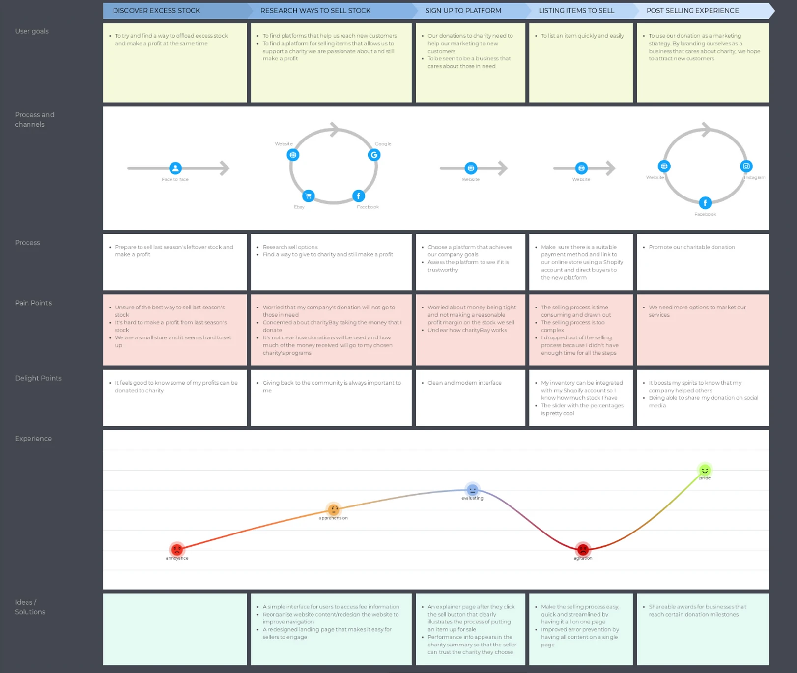
Individual owner seller
Individual sellers reported a greater desire to know that their donation was making a difference, compared to business owners. Individuals were more concerned with whether or not they could trust new charity, compared to corporate owners who prioritised profit.
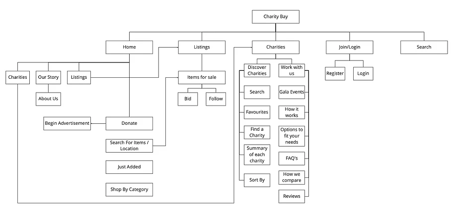
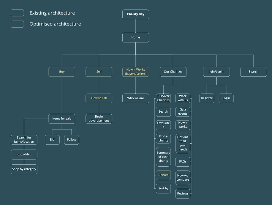
Information Architecture
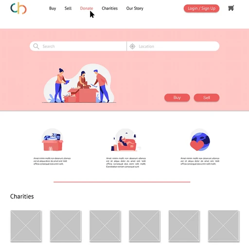
Current Information Architecture
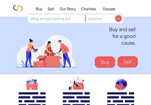
Optimised Information Architecture
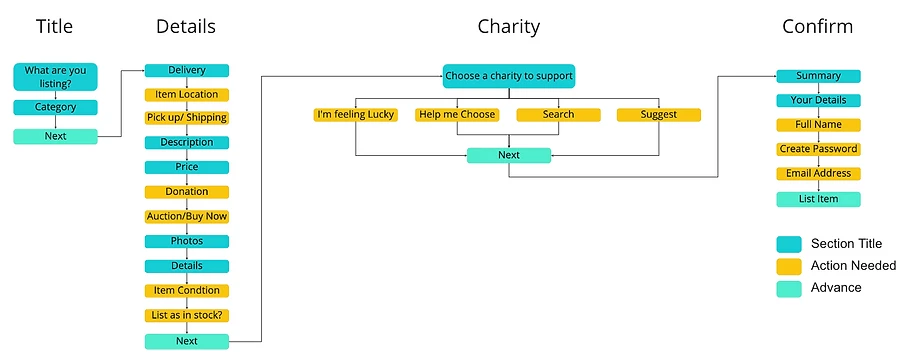
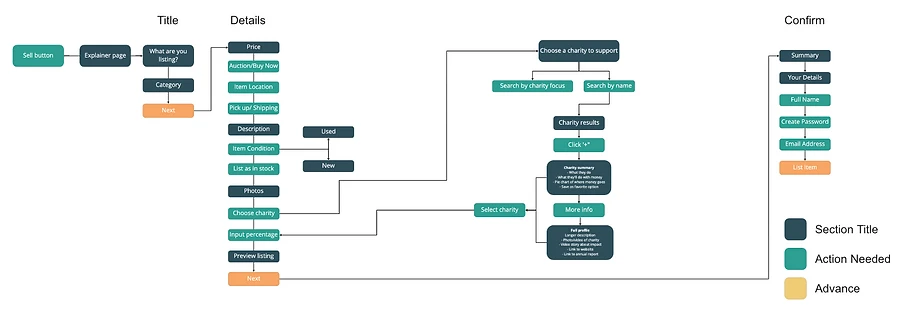
User Flow
Current User Flow
Optimised User Flow
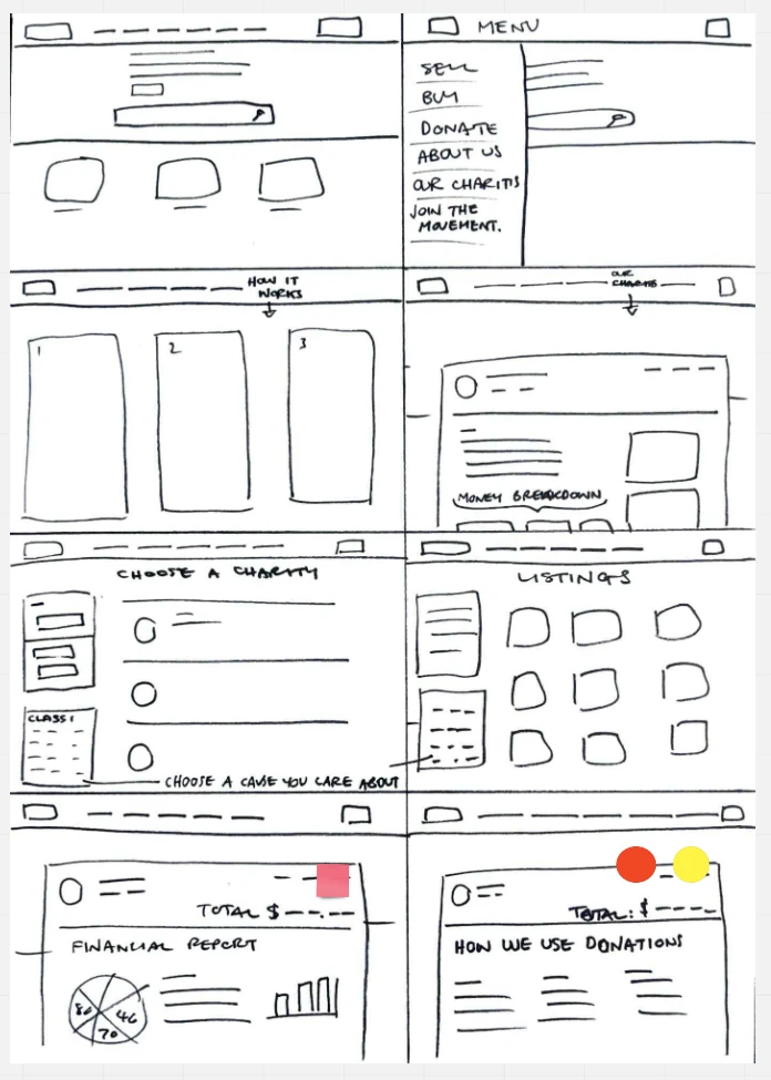
Initial Wireframe Sketches
Design options were explored, and the content hierarchy was developed in Figma. Initially, the features in the drawings were both too simple and too bright. A balance of minimalistic design was implemented while preserving core functions through the iterative design process and bouncing ideas within the team.
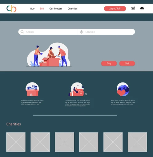
Mid-Fidelity Wireframes
Summary
What's Next
Mid-Fidelity Wireframes
After several iterations, the final designs were created. Focus on transparency, trust, and simplicity helped create designs that met the needs of the young, socially driven millennials.
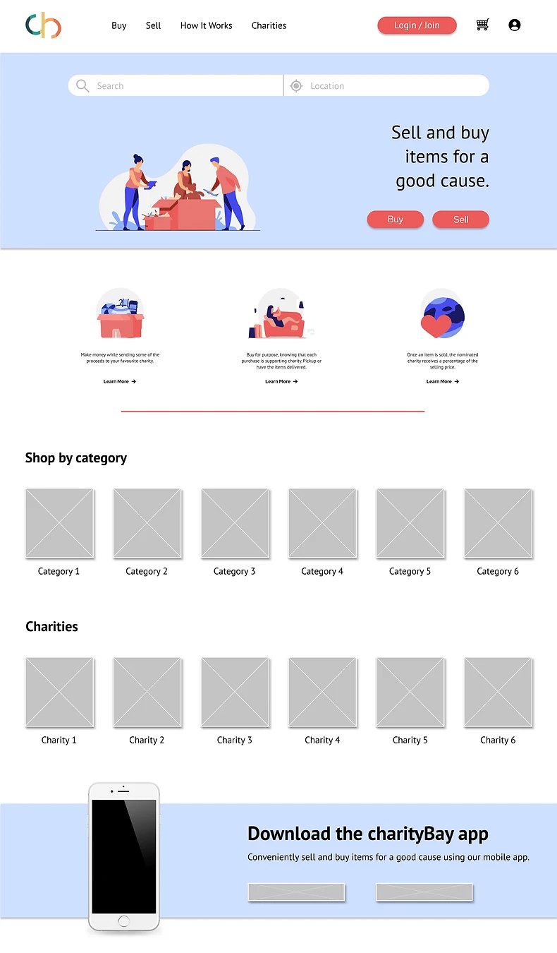
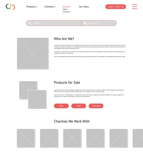
Home Page
The goal was to make each page's instructions as clear and succinct as possible, leaving no room for errors or misunderstanding. Changes in the content hierarchy proved helpful in meeting these objectives.
With this in mind, the landing page was streamlined by increasing white space, and moving the search bar higher up the screen so customers could see it upon arrival to the site. In order to better route the user to where they want to go, the number of calls to action was decreased.
In order to bring charityBay's mission to the landing page, the list of charities was brought to this screen, and included a "How It Works" option in the top menu bar. The How It Works option would include information that is currently located within the CharityBay platform but would be time-consuming for users to find. This option also increased the transparency of the platform and increased trust with the user, and new visitors could easily find information on how CharityBay works, and why they exist.
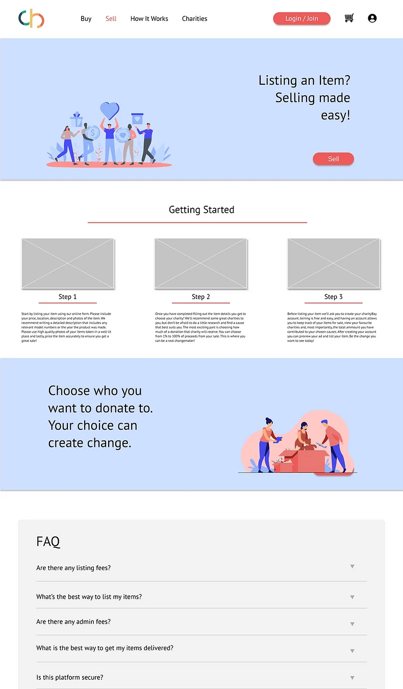
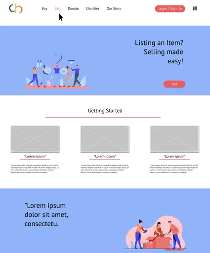
Getting Started
The site has a new page called "Getting Started" that provides a
step- by-step guide for the selling process to assist develop trust and transparency. An FAQ section was added to address any concerns users might face.
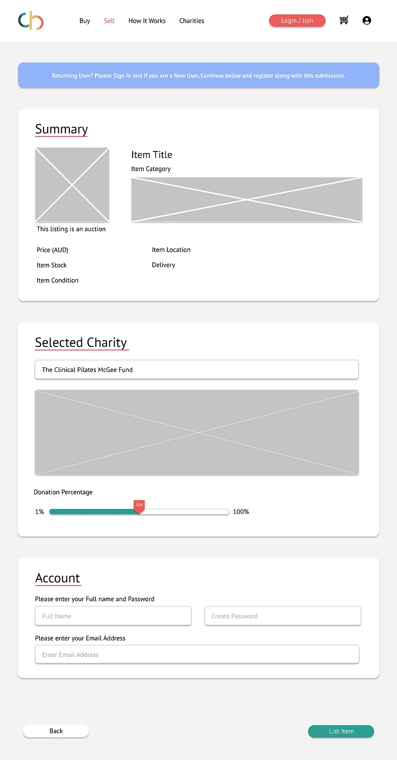
Summary Page
Before listing an item, users can check their information on the summary page. This summary guarantees that there are no problems in the product listing, and allows users to review content before publishing.
Selling Page
The team decided to take a step back with the selling page and examine what worked and what didn't with the existing listing process. The goal was to make the process smoother and clearer for the user by simplifying existing parts, reducing the number of displays, and streamlining the process. The current title and category pages were well-understood by the users, and the auto-categorise system was simple to use, so the design was retained.
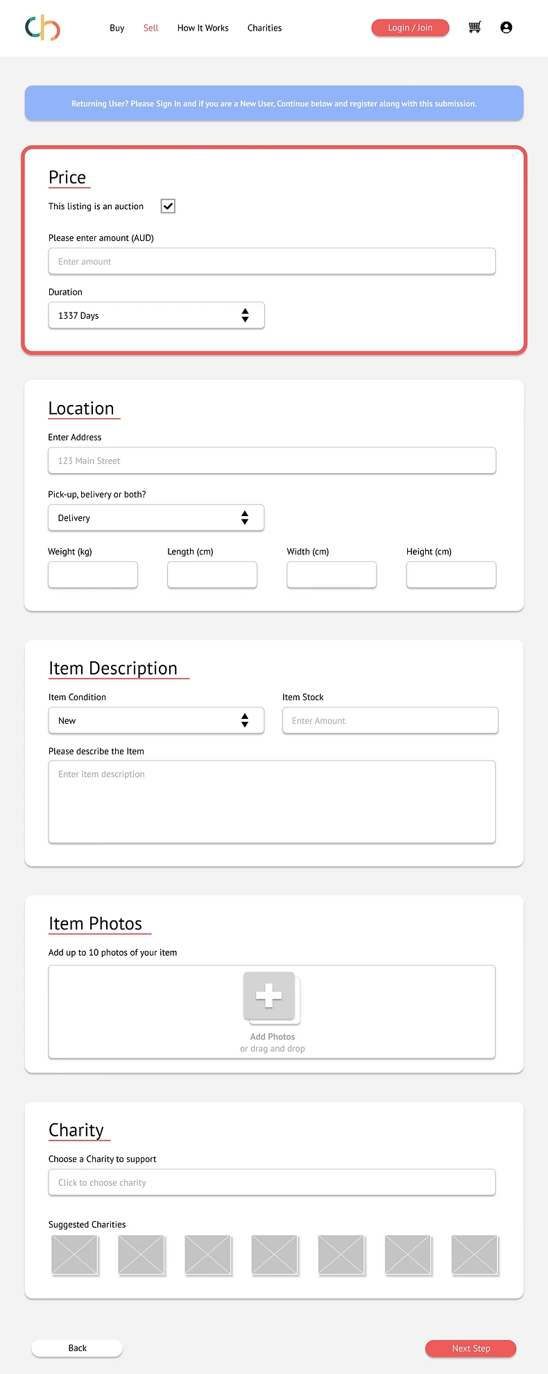
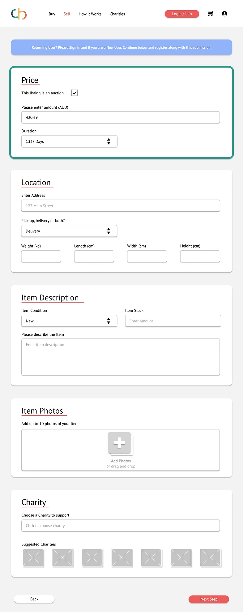
Selling Screen
On the next screen, the selling page was reduced to a single screen in keeping with competitors. This allows users to see what information is needed to complete the process without having to click through to each step. Red and green boxes were used to convey if an item has been actioned correctly.
Buttons with multiple choices were redesigned as drop-down menus to increase clarity for the user, as well as adjust some of the language used to better suit each instruction.
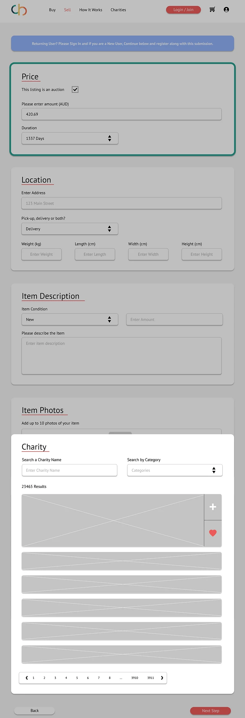
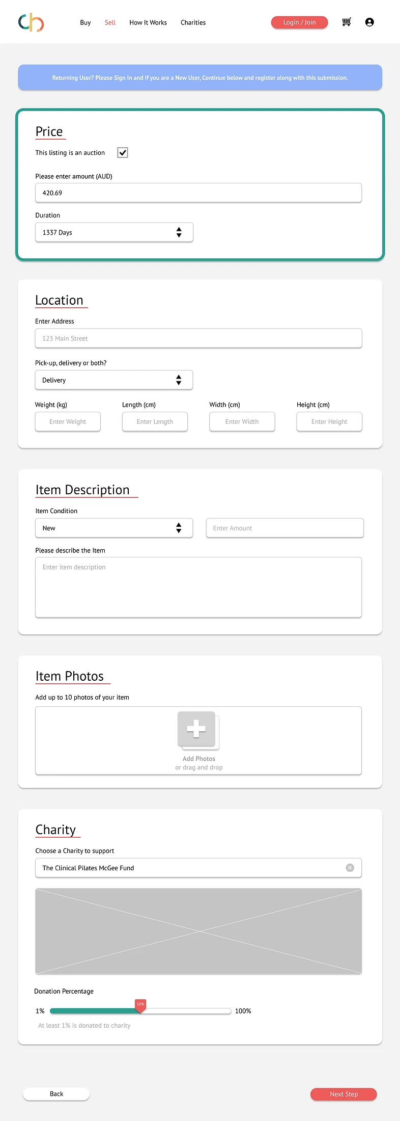
Charity Selection
On the selling page, a charity window appears. The user can select a charity from a list depending on the type of charity or the charity's name. By selecting the 'heart' icon, users can add their charity to a 'favourites' list. A full overview of each charity's goals and how they utilised donated funds might be included. This enables CharityBay to establish trust and openness with its users prior to the user listing their item. In order to create this level of involvement with the user, we've shifted the contribution drag bar to the last stage.
What's Next?
Use the terms buy and sell throughout,
Implement a new information architecture to make navigating from the home page easier.
Create a prototype and conduct usability testing on the new designs.
Create a page to make it easier for the seller to navigate the sales process.
Change selling process to new single-page design.
